Client: LC Lifecorp (2006)
Project: Brand Identity for LC Lifecorp
Challenge: Lifecorp, a sports marketing company, needed a mark that would inspire with-in the sports genre but also work within a business context.
Project Partner: Pixelstorm
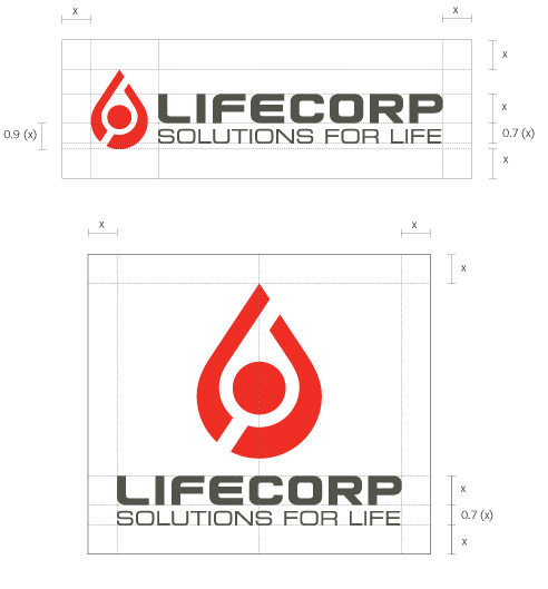
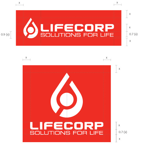
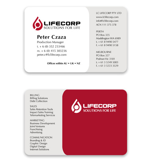
Solution: The logo is formed from a deep red tear shape which symbolises blood. This blood,and its movement, symbolises life. The diagonal “cuts” were inspired by the “ying yang” symbol, adding a dimension of balance and also energy. The logo is designed to be seen as a successful athlete who is either leaping forward to compete or raising his/her hands in the air in victory. The branding was then applied to various materials including stationary, website, exhibition materials, clothing and marketing materials.
Deliverables:
- Project management
- Concept development and creative direction
- Typography
- Graphic design
- Corporate identity microsite


