Client: LC Lifecorp (2006)
Project: Promax is a specialist sports nutrition company that designs and produces supplements to elite and professional sports people (mainly men), including bodybuilders.
Project Partner: Pixelstorm
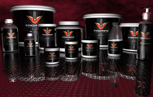
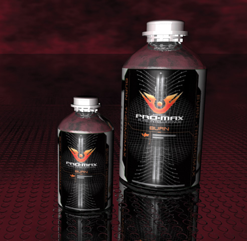
Challenge: Create a branding that portrays a quality and scientifically advanced look that would inspire athletes and stand out in a cluttered environment. The label system needed to be applied to 13 products, in a range of package sizes and include all compliance data, while unifying the family of products.
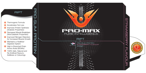
Solution: We developed the background graphics based on a hybrid of mesh and the human spine to portray the scientific look, mixed with performance and energy. A colour system was designed, with a colour to represent the product together with a colour to represent the flavour of the product. This was then used with simple typography to show the individual products with in the family.
Die cutting was used to give a unique shape to the labels, to make them stand out and to show the progressive design of the product. Finally we designed a quality guarantee logo to place on the products.
Female Audience?
We felt that the masculine design would hinder sales of the weight loss products to the female target audience so we designed a brand and set of labels for women. See the SupaSlim labels here.
Deliverables:
- Project management
- Concept development and creative direction
- Graphic design
- Graphic production
