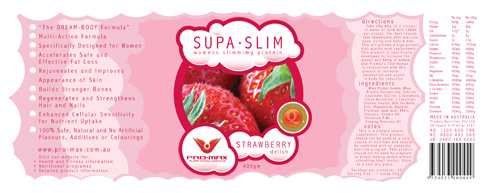
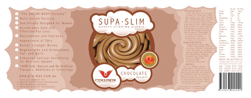
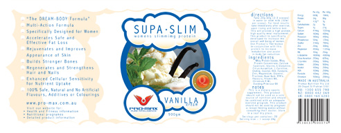
SupaSlim is a sub project of the Promax Branding and Product Label System.
We felt that the masculine design of Promax would hinder sales of the weight loss products that would also be consumed by a female target audience. We designed a set of labels for that target audience, meaning the product would appear to be two different products, one for men and one for women. The female packaging was designed to look like a ‘yummy milkshake’.
Download the SupaSlim Labels (2mb, 4 page PDF)
Deliverables:
- Project management
- Concept development and creative direction
- Graphic design
- Graphic production
